Rosie's Media
Sunday, 29 April 2012
Monday, 26 March 2012
Final Contents (Original Images)
This is my final design for the contents page of 'Crunk'. Although it was not compulsory to have the contents as a DPS (double page spread) I decided it fitted in with my style of magazine. 'Crunk' includes a lot of elements that feature in life-style magazines, such as 'Cosmopolitan' and 'Instyle'. The layout is similar to music magazines such as 'Q' so my design has taken an indiviudal interpretation of both styles, hence the DPS contents.
The house style cater's much more to the target audience (girls/women ages 16 - 24) due to the bold and bright fuschia pink used as the backing for each section; this alone emphasises the feminine aspects of the magazine.
The images used ae all original and have been developed using Adobe Photoshop. I have included captions on both images on page 1, both speech coming from the 'celebrity' in the image. This immediately creates a relationship with the audience, and also adds humour to the seriousness of the photos.
The mode of address suits the target audience well. The editor's section shows a friendly face talking in a friendly way and addressing the audience in a way that makes them feel as if even celebrities go through the same every day occurances that 'ordinary' people go through.
Final Front Cover (Original Images)
This my final front cover. The pink wash behind the masthead completes the design and links all the features together.
The final masthead has altered slightly. The reason for this is that the previous design had the right amount of edge to symbolise the style of music but it did not suit is target audience as well as it could, hence the change to fuschia pink.
I have include a variety of codes and conventions within the text by using different styles of font and colour.
The features are all appropriate for the target audience because they are typically feminine.
Pre-lim - St Andrews Magazine Cover
Positive Features:
The language and terminology used is perfect for the target audience of Year 11 Girls.
The name of the magazine works and the central image has positive structure due to the posture of the model and the fact that she has eye contact with the audience.
There is good use of codes and conventions alike to real media products.
Negative Features:
The masthead needs to be larger so that it appeals more to the audience and makes it more eye-catching.
The background needs to be stronger - the light blue is sickly and swallows the image (due to the blue shirt) preventing it from being bold; thus preventing reader engagement.
The image needs to bigger so that it covers the entire page.
Yellow is hard to read, make it stand out (with an outline, different colour, or make it bigger).
Lastly, vary the style of font more so that the cover is over all more eye-catching.
Sunday, 25 March 2012
EXTENSION - Crunk Website
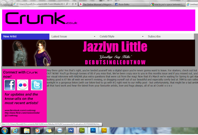
I created this website for Crunk magazine using Adobe Dreamweaver with CSS and HTML code. I entered a SPRY MENU BAR which includes a drop-down menu for particular tabs which would then lead to other pages. I have included links to a TWITTER page, FACEBOOK page and FLICKR page which have also been created for Crunk Music Magazine.
This would be to digitalise the brand of Crunk and use different platforms like a website, apps and social networking to cater to the information age that is my target audience.
Saturday, 17 March 2012
Subscribe to:
Comments (Atom)


